Yesterday I tried a classroom activity inspired by an activity that Dan Meyer posted on his blog. For anyone who hasn’t heard of Dan Meyer, he is a very inspiring maths teacher in the US who works very hard to create engaging maths tasks that hook students in and make maths far more engaging. Far from dumbing things down or simply inserting a trivial context to try and get the students interested, his work reaches them at their level and uses accessible and relevant situations to motivate.
Even though it was designed with a maths class in mind, I incorporated his tire marks task in my Year 10 motion unit. I wanted to give my students some exposure to how our study of motion can solve real world problems. (Full credit to Dan for the images).
The students had to look at this image of an accident, complete with skid mark:
 For reference, they then look at overhead images of 3 other accidents:

They then get to see the same image with some data they can work with (which I changed from Dan’s original to metric (skid marks in m, speeds in km/h):

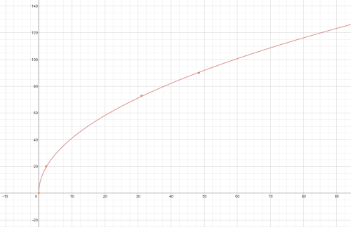
They then had to graph this data using Desmos, to help them to work out how fast the car was going in the original accident:
Some of the highlights were:
- The students were interested and engaged – they could see some real world context and see how physics applies to a real problem.
- They really wanted to know the answer.
- They were engaging with complex, high level skills – pushing their boundaries, and venturing outside of their comfort zone.
Some of the challenges:
- It was a very mixed ability class with maths – the differences in students’ skills and confidence become increasingly obvious as the activity progressed. This made it very hard to tailor the level of explanation and instruction to where the students were at.
- It introduced a whole lot of new skills at once, including the use of Desmos, creating square root graphs etc. This confused them a bit and was too much for some.
- It was a very disrupted lesson – this activity happened in two parts over two lessons that were one week apart, so it was disjointed and broke the flow.
- Creating a graph from real world variables (rather than just x and y) confused students. I’d be surprised if they have ever had to do this before!
Interpreting the graph was also difficult for some. I’d tried to scaffold the graph creation part as well as I could but a number were still lost as to what was what, and I don’t know if its possible to label the axes in Desmos to make it clearer what each one was.
- Not many got to measuring the questioned skid mark due to time constraints, which was a real shame. I’d hoped that they would’ve gotten more chance to see it through to the end, but it wasn’t to be.
Some improvements for the future:
- Break up the new skills so it isn’t all these new things all at once.
- Give them several different options for creating the graph – the use of Desmos opened up a whole lot of new possibilities but a lot of skill was required to make it work, so it was a stumbling block for quite a few.
- Give the students more explicit instructions. This was purely because I wasn’t organised enough in time. Perhaps a screencast or more detailed written instructions might serve the purpose here.
- More dedicated time to the activity, to work in groups.
All in all, it was a difficult and challenging activity that was worth plunging in for.